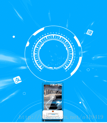
1.先瞧瞧效果: 2.代码是这样的: img src=images/circle.png alt= id=circle/@mixin ani-btnRotate{ @keyframes btnRotate{ from{transform: rotateZ(0);} to{transform: rotateZ(360deg);} }}@include ani-btnRotate;#circle{ position: absolu
2.代码是这样的:
<img src="images/circle.png" alt="" id="circle"/>
@mixin ani-btnRotate{
    @keyframes btnRotate{
        from{transform: rotateZ(0);}
        to{transform: rotateZ(360deg);}
    }
}
@include ani-btnRotate;
#circle{
    position: absolute;
    left: 50%;
    width: REM(338);
    height:  REM(338);
    margin-top: REM(200);
    margin-left: REM(-338/2);
    transform-origin: center center ;
    animation: btnRotate 1s 1s linear forwards;
    }
用到的图片是这个:(就是白色转动的那个图片)

以上就是html5让图片转圈的动画效果的实现方法介绍的详细内容,更多请关注自由互联其它相关文章!