本文来源于Element官方文档: http://element-cn.eleme.io/#/zh-CN/component/carousel 基础用法 普通走马灯 div class="block"span class="demonstration"默认 Hover 指示器触发/spanel-carousel height="150px"el-carousel-item
本文来源于Element官方文档:
http://element-cn.eleme.io/#/zh-CN/component/carousel
基础用法
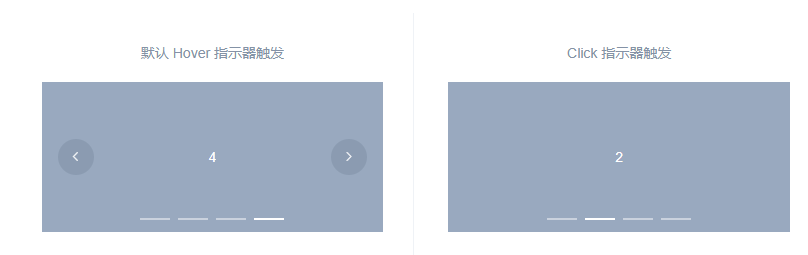
普通走马灯
<div class="block">
<span class="demonstration">默认 Hover 指示器触发</span>
<el-carousel height="150px">
<el-carousel-item v-for="item in 4" :key="item">
<h3>{{ item }}</h3>
</el-carousel-item>
</el-carousel>
</div>
<div class="block">
<span class="demonstration">Click 指示器触发</span>
<el-carousel trigger="click" height="150px">
<el-carousel-item v-for="item in 4" :key="item">
<h3>{{ item }}</h3>
</el-carousel-item>
</el-carousel>
</div>
组件— 走马灯
基础用法
<template>
 <div class="block">
  <span class="demonstration">默认 Hover 指示器触发</span>
  <el-carousel height="150px">
   <el-carousel-item v-for="item in 4" :key="item">
    <h3 class="small">{{ item }}</h3>
   </el-carousel-item>
  </el-carousel>
 </div>
 <div class="block">
  <span class="demonstration">Click 指示器触发</span>
  <el-carousel trigger="click" height="150px">
   <el-carousel-item v-for="item in 4" :key="item">
    <h3 class="small">{{ item }}</h3>
   </el-carousel-item>
  </el-carousel>
 </div>
</template>

<style>
 .el-carousel__item h3 {
  color: #475669;
  font-size: 14px;
  opacity: 0.75;
  line-height: 150px;
  margin: 0;
 }

 .el-carousel__item:nth-child(2n) {
   background-color: #99a9bf;
 }

 .el-carousel__item:nth-child(2n+1) {
   background-color: #d3dce6;
 }
</style>
指示器

<template>
 <div class="block">
  <span class="demonstration">默认 Hover 指示器触发</span>
  <el-carousel height="150px">
   <el-carousel-item v-for="item in 4" :key="item">
    <h3 class="small">{{ item }}</h3>
   </el-carousel-item>
  </el-carousel>
 </div>
 <div class="block">
  <span class="demonstration">Click 指示器触发</span>
  <el-carousel trigger="click" height="150px">
   <el-carousel-item v-for="item in 4" :key="item">
    <h3 class="small">{{ item }}</h3>
   </el-carousel-item>
  </el-carousel>
 </div>
</template>

<style>
 .el-carousel__item h3 {
  color: #475669;
  font-size: 14px;
  opacity: 0.75;
  line-height: 150px;
  margin: 0;
 }

 .el-carousel__item:nth-child(2n) {
   background-color: #99a9bf;
 }

 .el-carousel__item:nth-child(2n+1) {
   background-color: #d3dce6;
 }
</style>
切换箭头
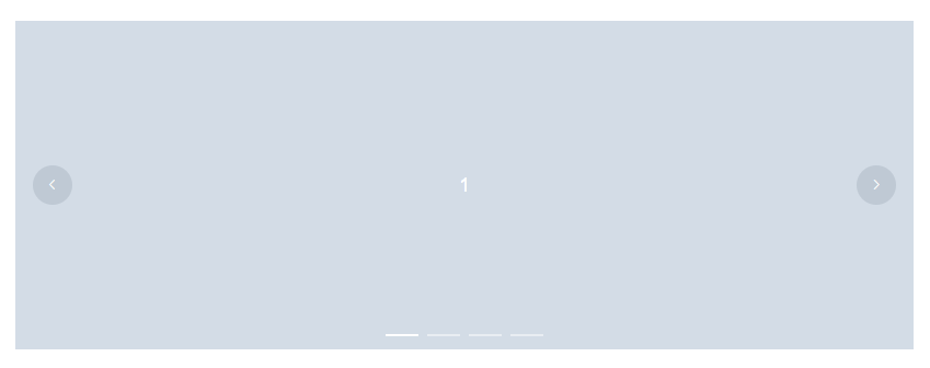
<template>
 <div class="block">
  <span class="demonstration">默认 Hover 指示器触发</span>
  <el-carousel height="150px">
   <el-carousel-item v-for="item in 4" :key="item">
    <h3 class="small">{{ item }}</h3>
   </el-carousel-item>
  </el-carousel>
 </div>
 <div class="block">
  <span class="demonstration">Click 指示器触发</span>
  <el-carousel trigger="click" height="150px">
   <el-carousel-item v-for="item in 4" :key="item">
    <h3 class="small">{{ item }}</h3>
   </el-carousel-item>
  </el-carousel>
 </div>
</template>

<style>
 .el-carousel__item h3 {
  color: #475669;
  font-size: 14px;
  opacity: 0.75;
  line-height: 150px;
  margin: 0;
 }

 .el-carousel__item:nth-child(2n) {
   background-color: #99a9bf;
 }

 .el-carousel__item:nth-child(2n+1) {
   background-color: #d3dce6;
 }
</style>
卡片化
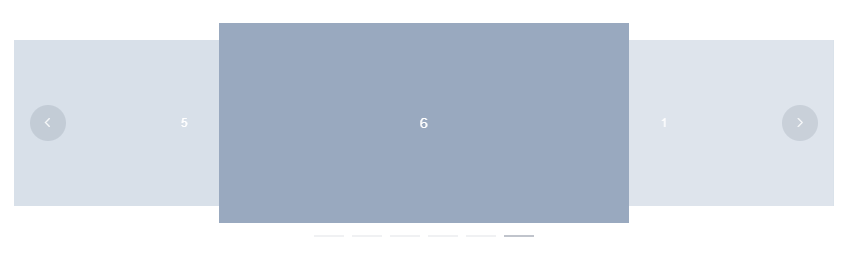
<template>
 <el-carousel :interval="4000" type="card" height="200px">
  <el-carousel-item v-for="item in 6" :key="item">
   <h3 class="medium">{{ item }}</h3>
  </el-carousel-item>
 </el-carousel>
</template>

<style>
 .el-carousel__item h3 {
  color: #475669;
  font-size: 14px;
  opacity: 0.75;
  line-height: 200px;
  margin: 0;
 }

 .el-carousel__item:nth-child(2n) {
  background-color: #99a9bf;
 }

 .el-carousel__item:nth-child(2n+1) {
  background-color: #d3dce6;
 }
</style>
方向

<template>
 <el-carousel height="200px" direction="vertical" :autoplay="false">
  <el-carousel-item v-for="item in 3" :key="item">
   <h3 class="medium">{{ item }}</h3>
  </el-carousel-item>
 </el-carousel>
</template>

<style>
 .el-carousel__item h3 {
  color: #475669;
  font-size: 14px;
  opacity: 0.75;
  line-height: 200px;
  margin: 0;
 }

 .el-carousel__item:nth-child(2n) {
  background-color: #99a9bf;
 }

 .el-carousel__item:nth-child(2n+1) {
  background-color: #d3dce6;
 }
</style>
Carousel Attributes
参数
说明
类型
可选值
默认值
Carousel Events
事件名称
说明
回调参数
Carousel Methods
方法名
说明
参数
Carousel-Item Attributes
参数
说明
类型
可选值
默认值
到此这篇关于Element Carousel 走马灯的具体实现的文章就介绍到这了,更多相关Element Carousel 走马灯内容请搜索易盾网络以前的文章或继续浏览下面的相关文章希望大家以后多多支持易盾网络!