我必须使边框覆盖它的内容以匹配此图像的外观: 我得到了它的全貌: 我需要将边框覆盖为绿色内容.我怎么能完成它?正如我研究的那样,我不能使用z-index. HTML和CSS代码如下: .box-b
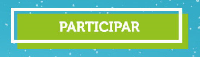
我得到了它的全貌:

我需要将边框覆盖为绿色内容.我怎么能完成它?正如我研究的那样,我不能使用z-index. HTML和CSS代码如下:
.box-border a {
  color: white;
  text-transform: uppercase;
  font-weight: bold;
  font-size: 16px;
}

.box-border a:hover {
  text-decoration: none;
  color: white;
  cursor: pointer;
}


.box-border-participe {
  position: relative;
  float: right;
  margin-right: 30%;
  border: 4px solid white;
}

.box-participe {
  background-color: #94C120;
  padding: 10px 40px;
  margin-left: 5px;
  margin-top: 5px;
  margin-bottom: -20px;
  margin-right: -20px;
}

body {
  background:grey;
}
<div class="box-border box-border-participe">
  <div class="box-participe">
    <a>Participe</a>
  </div>
</div>
您可以考虑使用伪元素来创建边框并避免额外的标记.您还可以轻松控制其位置/大小:
body {
  background: grey;
}

.button {
  background: #94c120;
  width: 200px;
  height: 50px;
  margin: 50px;
  position: relative;
}

.button:before {
  content: "";
  position: absolute;
  top: -15px;
  left: -15px;
  width: 100%;
  height: 100%;
  border: 5px solid #fff;
  box-sizing: border-box;
}
<div class="button">
  some text
</div>
这是使用线性渐变和多个背景的另一个想法:
body {
 background:grey;
}
.button {
  width: 200px;
  height: 80px;
  margin: 50px;
  padding:20px 0 0 20px;
  box-sizing:border-box;
  background:
    linear-gradient(to right,#fff 5px,transparent 5px calc(100% - 5px),#fff calc(100% - 5px)) 0 0/ calc(100% - 10px) calc(100% - 10px),
    linear-gradient(to bottom,#fff 5px,transparent 5px calc(100% - 5px),#fff calc(100% - 5px)) 0 0/ calc(100% - 10px) calc(100% - 10px),
    linear-gradient(#94c120,#94c120) 15px 15px;
  background-repeat:no-repeat;
}
<div class="button">
  some text
</div>
渐变的另一种语法:
body {
 background:grey;
}
.button {
  width: 200px;
  height: 80px;
  margin: 50px;
  padding:20px 0 0 20px;
  box-sizing:border-box;
  background:
    linear-gradient(#fff,#fff) left -10px top     0  /100% 5px,
    linear-gradient(#fff,#fff) top  -10px left    0  /5px 100%,
    linear-gradient(#fff,#fff) left -10px bottom 10px/100% 5px,
    linear-gradient(#fff,#fff) top  -10px right  10px/5px 100%,
    linear-gradient(#94c120,#94c120) 20px 20px;
  background-repeat:no-repeat;
}
<div class="button">
  some text
</div>
使用背景和盒子阴影的另一个想法:
body {
 background:grey;
}
.button {
  width: 200px;
  height: 80px;
  margin: 50px;
  padding:15px 0 0 15px;
  box-sizing:border-box;
  background: #94c120 content-box;
  border:5px solid #fff;
  box-shadow: 20px 20px 0px #94c120; /* value of padding + border*/
}
<div class="button">
  some text
</div>