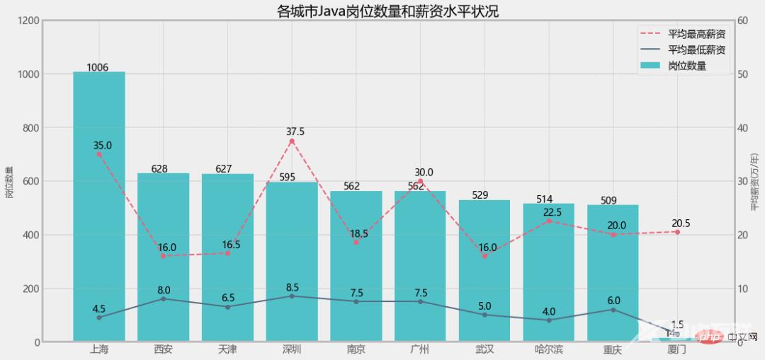
今天给大家介绍使用Python的matplotlib库绘制双y轴图及其图例设置问题,希望对大家有所帮助,如有疑问或者建议可以私信小编。 效果图预览: 示例数据: df = pd.read_csv(jobdata.csv) 1、双
df = pd.read_csv('jobdata.csv')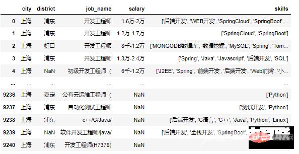
1. 岗位数量折线图
colors = ["#51C1C8", "#536D84","#E96279"]
plt.figure(figsize=(16, 8))
ax1 = plt.subplot(111)
ax1.set_ylim(0,1200)
lin0 = ax1.plot(x_data, y_data1, marker='o', color=colors[0], label='岗位数量')
for x, y in enumerate(y_data1):
    plt.text(x - 0.2, y+5, y)
ax1.set_ylabel('岗位数量',fontsize=12)
plt.legend()
plt.title("各城市Java岗位数量")
plt.show()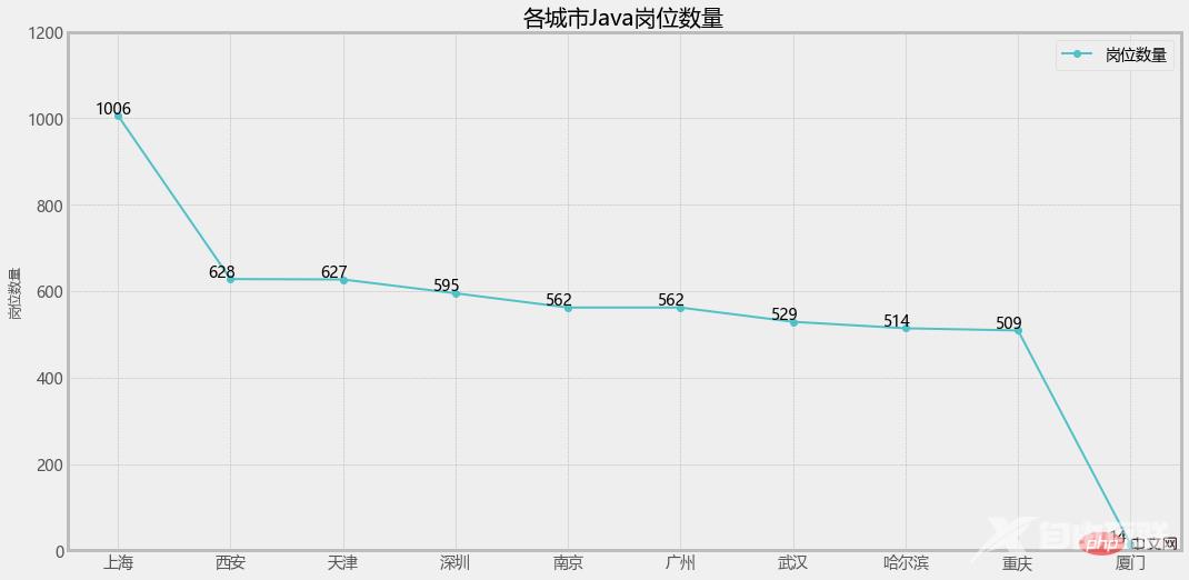
# 增加y轴
ax2 = ax1.twinx()

ax2.set_ylim(0,60)
lin1 = ax2.plot(x_data, y_data2, linestyle='--', marker='o', c=colors[1], label='平均最低薪资')
for x, y in enumerate(y_data2):
    plt.text(x - 0.1, y+1, y)
lin2 = ax2.plot(x_data, y_data3, linestyle='--', marker='o', c=colors[2], label='平均最高薪资')
for x, y in enumerate(y_data3):
    plt.text(x - 0.1, y+1, y)
ax2.set_ylabel('平均薪资(万/年)',fontsize=12)
plt.legend()
plt.title("各城市Java岗位数量和薪资水平状况")
plt.show()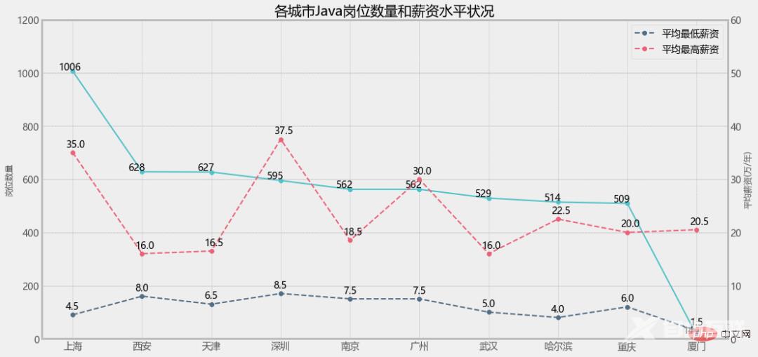
ax1.legend(loc='best')
ax2.legend(loc='best')
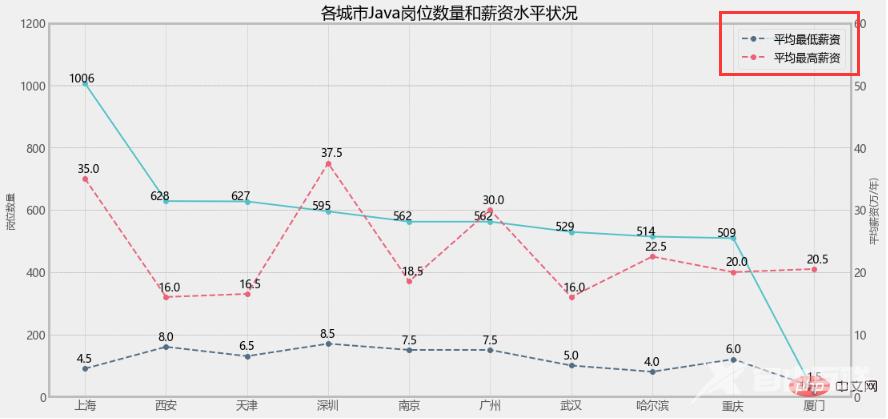
ax1.legend(loc=2)
ax2.legend(loc=1)
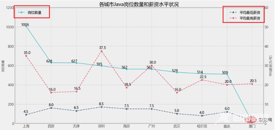
lines = lin0+lin1+lin2
labs = [label.get_label() for label in lines]
plt.legend(lines,labs)
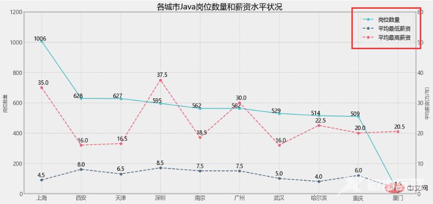
大功告成!
但是!如果是柱状图+折线图的情况,效果还一样吗?
但是!如果是柱状图+折线图的情况,效果还一样吗?
但是!如果是柱状图+折线图的情况,效果还一样吗?
plt.figure(figsize=(16, 8))
a1 = plt.subplot(111)
a1.set_ylim(0,1200)
bar = a1.bar(x_data, y_data1, color=colors[0], label='岗位数量')
for x, y in enumerate(y_data1):
    plt.text(x - 0.2, y+5, y)
a1.set_ylabel('岗位数量',fontsize=12)

...

lines = bar+lin1+lin2
labs = [label.get_label() for label in lines]
plt.legend(lines,labs)
直接报错了!


提示类型不一致,显然是bar和line的类型问题,我们查一下源码:
matplotlib.axes.Axes.plot: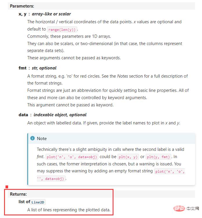
legend_handles = [
    Line2D([], [], linewidth=1, ls='--', lw=2, c=colors[2], label='平均最高薪资'),
    Line2D([], [], linewidth=1, lw=2, c=colors[1], label='平均最低薪资'),
    patches.Rectangle((0, 0), 1, 1, facecolor=colors[0],label='岗位数量')
]
plt.legend(handles=legend_handles, loc='best', fontsize=14)