CSS3动画属性并不是很多,但重点其实是你怎样去运用它,从简单的hover状态或复杂的小动画,都可以巧妙的用CSS3动画属性来实现。
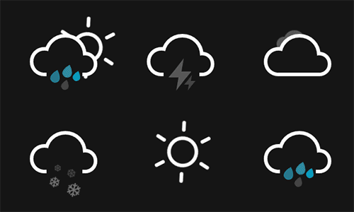
今天主要是和大家分享一个比较有创意、实用的CSS天气图标动画,静态的天气图标看上去是很呆板,若加上动画,看起来会更加真实生动,以下例子就是很好的参考案例。
下面我们来做一个会下雨的天气图标实例,过程其实很简单哦。
STEP1: 整体HTML架构
复制代码代码如下:
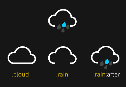
<div class="icon rainy">
<div class="cloud"></div>
<div class="rain"></div>
</div>
STEP2: 用CSS绘制云朵图标
CSS代码如下
复制代码代码如下:
body {
max-width: 42em;
padding: 2em;
margin: 0 auto;
color: #161616;
font-family: 'Roboto', sans-serif;
text-align: center;
background-color: currentColor;
}
.icon {
position: relative;
display: inline-block;
width: 12em;
height: 10em;
font-size: 1em; /* control icon size here */
}
.cloud {
position: absolute;
z-index: 1;
top: 50%;
left: 50%;
width: 3.6875em;
height: 3.6875em;
margin: -1.84375em;
background: currentColor;
border-radius: 50%;
box-shadow:
-2.1875em 0.6875em 0 -0.6875em,
2.0625em 0.9375em 0 -0.9375em,
0 0 0 0.375em #fff,
-2.1875em 0.6875em 0 -0.3125em #fff,
2.0625em 0.9375em 0 -0.5625em #fff;
}
.cloud:after {
content: '';
position: absolute;
bottom: 0;
left: -0.5em;
display: block;
width: 4.5625em;
height: 1em;
background: currentColor;
box-shadow: 0 0.4375em 0 -0.0625em #fff;
}
.cloud:nth-child(2) {
z-index: 0;
background: #fff;
box-shadow:
-2.1875em 0.6875em 0 -0.6875em #fff,
2.0625em 0.9375em 0 -0.9375em #fff,
0 0 0 0.375em #fff,
-2.1875em 0.6875em 0 -0.3125em #fff,
2.0625em 0.9375em 0 -0.5625em #fff;
opacity: 0.3;
transform: scale(0.5) translate(6em, -3em);
animation: cloud 4s linear infinite;
}
.cloud:nth-child(2):after { background: #fff; }
.rain{
position: absolute;
z-index: 2;
top: 50%;
left: 50%;
width: 3.75em;
height: 3.75em;
margin: 0.375em 0 0 -2em;
background: currentColor;
}
.rain:after {
content: '';
position: absolute;
z-index: 2;
top: 50%;
left: 50%;
width: 1.125em;
height: 1.125em;
margin: -1em 0 0 -0.25em;
background: #0cf;
border-radius: 100% 0 60% 50% / 60% 0 100% 50%;
box-shadow:
0.625em 0.875em 0 -0.125em rgba(255,255,255,0.2),
-0.875em 1.125em 0 -0.125em rgba(255,255,255,0.2),
-1.375em -0.125em 0 rgba(255,255,255,0.2);
transform: rotate(-28deg);
animation: rain 3s linear infinite; /*设置动画 rain */
}
STEP3: 下雨动画
/* 下雨动画 Animations */
@keyframes rain {
0% {
background: #0cf;
box-shadow:
0.625em 0.875em 0 -0.125em rgba(255,255,255,0.2),
-0.875em 1.125em 0 -0.125em rgba(255,255,255,0.2),
-1.375em -0.125em 0 #0cf;
}
25% {
box-shadow:
0.625em 0.875em 0 -0.125em rgba(255,255,255,0.2),
-0.875em 1.125em 0 -0.125em #0cf,
-1.375em -0.125em 0 rgba(255,255,255,0.2);
}
50% {
background: rgba(255,255,255,0.3);
box-shadow:
0.625em 0.875em 0 -0.125em #0cf,
-0.875em 1.125em 0 -0.125em rgba(255,255,255,0.2),
-1.375em -0.125em 0 rgba(255,255,255,0.2);
}
100% {
box-shadow:
0.625em 0.875em 0 -0.125em rgba(255,255,255,0.2),
-0.875em 1.125em 0 -0.125em rgba(255,255,255,0.2),
-1.375em -0.125em 0 #0cf;
}
}
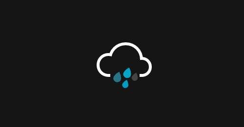
最图效果:
以上所述是针对CSS icon图标之纯CSS实现带动画效果的天气图标 的全部内容,希望对大家有所帮助。