Css3圆角讲解:想必大家对于图片,背景圆角,都不陌生吧,
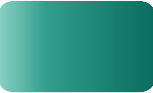
圆角语法:border-radius:圆角值;
CSS3圆角的优点
传统的圆角生成方案,必须使用多张图片作为背景图案。CSS3的出现,使得我们再也不必浪费时间去制作这些图片了,而且还有其他多个优点:
* 减少维护的工作量。图片文件的生成、更新、编写网页代码,这些工作都不再需要了。
* 提高网页性能。由于不必再发出多余的HTTP请求,网页的载入速度将变快。
* 增加视觉可靠性。某些情况下(网络拥堵、服务器出错、网速过慢等等),背景图片会下载失败,导致视觉效果不佳。CSS3就不会发生这种情况。
这个值可以使用:em ,ex,pt,px,百分比;
Border-radius跟margin,padding差不多
Border-radius:lefttop,righttop,rightbottom,leftbottom。
复制代码代码如下:
<div class="box1">
</div>
.box1{width:200px;height:100px;border-radius:30px 5px;background:#f66f17;margin-top:30px;}

复制代码代码如下:
<div class="box2"></div>
.box2{width:200px;height:100px;border-radius:30px 20px 10px 0px;background:#f66f17;margin-top:30px;}

对于圆角理解起来应该,很简单。
对于百分比:目前最安全的做法,就是将每个圆角边框的风格和宽度,都设为一样的值,并且避免使用百分比值。
IE9以下是不支持此属性
线性渐变:background:linear-gradient(设置渐变形式,第一个颜色起点,中间颜色点 中间颜色的位置,结束点颜色);
Linear:渐变的类型(线性渐变);
渐变的形式:可选参数 有两种方式-1、设置旋转角度,0度代表水平从左到右,90度就是从上到下啦,从0度开始逆时针变换。
2、使用关键字,left代表从左到右,top代表从上到下,同理right就是从右到左,lefttop-从坐上到右下,同理leftbottom,righttop,rightbottom。
中间颜色与中间颜色位置为可选参数。
不过要考虑浏览器的兼容,咱们这样写:
-webkit-gradient(linear,0 0,0 100%,from(起始颜色,to(结束颜色)); /*for Safari4+,Chrome 2+*/
-webkit-linear-gradient(起始颜色, 结束颜色); /*for Safari 5.1+,Chrome 10+*/
-moz-linear-gradient(起始颜色, 结束颜色); /*for firefox*/
-o-linear-gradient(起始颜色, 结束颜色); /*Opera*/
linear-gradient(起始颜色, 结束颜色); /*标准属性*/
对于IE来说是个麻烦事,老办法
Filter:progid:DXImageTransform.Microsoft.gradient(startColorstr=’ 起始颜色’,endColorstr=” 结束颜色”); /*IE6,IE 7*/
-ms-linear-gradient(起始颜色, 结束颜色); /*IE8*/
复制代码代码如下:
<div class="content1"></div>
.content1{width:500px;height:300px;border-radius:10%;background:#ade691;
background:-webkit-linear-gradient(left,#88cfc3,#329e8c 30%,#096e5d);background:-moz-linear-gradient(left,#88cfc3,#329e8c 30%,#096e5d);background:filter: progid:DXImageTransform.Microsoft.gradient(startColorstr='#88cfc3', endColorstr='#096e5d'); /* IE6,IE7 */-ms-filter: "progid:DXImageTransform.Microsoft.gradient(startColorstr='#88cfc3', endColorstr='#096e5d')";background:linear-gradient(lleft,#88cfc3,#329e8c 30%,#096e5d;float:left;}
.tit1{font-size:3em;font-weight: bold;color:#f00;}
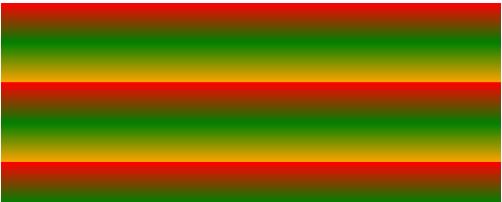
重复性线性渐变:repeating-linear-gradient属性来代替线性渐变linear-gradient;
复制代码代码如下:
<div class="content2"></div>
.content2{width:500px;height:200px;
background-image: -webkit-repeating-linear-gradient(red,green 40px, orange 80px);
background-image: repeating-linear-gradient(red,green 40px, orange 80px);}
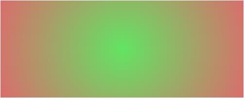
径向渐变:radial-gradient(设置渐变的中心,渐变形状 渐变大小,起始颜色值,中间颜色值 中间颜色位置,终点颜色)
渐变中心,可选参数,如30px 20px指距离左侧30px距离上侧20px,可以是像素,可以是百分比,也可以是关键字,默认为中心位置。
渐变形状,可选参数,可以取值circle或eclipse【默认】
渐变大小,可循环参数,可以取值
closest-side:
指定径向渐变的半径长度为从圆心到离圆心最近的边
closest-corner:
指定径向渐变的半径长度为从圆心到离圆心最近的角
farthest-side:
指定径向渐变的半径长度为从圆心到离圆心最远的边
farthest-corner:
指定径向渐变的半径长度为从圆心到离圆心最远的角
contain:
包含,指定径向渐变的半径长度为从圆心到离圆心最近的点。类同于closest-side
cover:
覆盖,指定径向渐变的半径长度为从圆心到离圆心最远的点。类同于farthest-corner
circle farthest-corner圆形渐变,ellipse farthest-corner椭圆渐变
复制代码代码如下:
<div class="content3"></div>
.content3{width:500px;height:200px;
background-image: -webkit-radial-gradient(circle,hsla(120,70%,60%,.9),hsla(360,60%,60%,.9));
background-image: radial-gradient(circle,hsla(120,70%,60%,.9),hsla(360,60%,60%,.9));margin-top:20px;}