目录 效果 前言 使用 引入material包 常规 图标 圆角 Button描边 文字描边 文字按钮 圆形Button 源码分析icon 属性 Github 感谢 最后 效果 前言 先来看一下 MaterialButton 是什么 由上图可以看到
目录
- 效果
- 前言
- 使用
- 引入material包
- 常规
- 图标
- 圆角
- Button描边
- 文字描边
- 文字按钮
- 圆形Button
- 源码分析icon
- 属性
- Github
- 感谢
- 最后
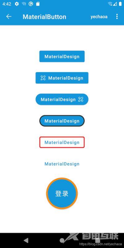
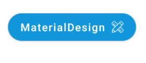
效果
前言
先来看一下MaterialButton是什么
由上图可以看到MaterialButton也没有什么神秘的,不过是Button的一个子类而已,但是经过谷歌的封装之后,在符合Material Design的基础上,使用起来更加方便了,且容易实现预期效果。
使用
引入material包
implementation 'com.google.android.material:material:1.2.1'
常规
<com.google.android.material.button.MaterialButton
    android:layout_width="wrap_content"
    android:layout_height="wrap_content"
    android:text="@string/app_name"
    android:textAllCaps="false" />
与Button使用无异,textAllCaps是取消全部大小写。
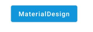
图标
<com.google.android.material.button.MaterialButton
    android:layout_width="wrap_content"
    android:layout_height="wrap_content"
    android:layout_marginTop="20dp"
    android:text="@string/app_name"
    android:textAllCaps="false"
    app:icon="@mipmap/ic_launcher" />
app:icon属性指定图标。
圆角
<com.google.android.material.button.MaterialButton
    android:id="@+id/btn"
    android:layout_width="wrap_content"
    android:layout_height="wrap_content"
    android:layout_marginTop="20dp"
    android:text="@string/app_name"
    android:textAllCaps="false"
    app:cornerRadius="25dp"
    app:icon="@mipmap/ic_launcher"
    app:iconGravity="end" />
app:cornerRadius属性指定圆角大小。
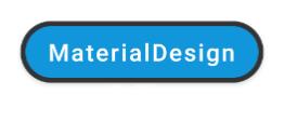
Button描边
<com.google.android.material.button.MaterialButton
    android:layout_width="wrap_content"
    android:layout_height="wrap_content"
    android:layout_marginTop="20dp"
    android:text="@string/app_name"
    android:textAllCaps="false"
    app:cornerRadius="25dp"
    app:strokeColor="@color/black"
    app:strokeWidth="3dp" />
app:strokeColor描边颜色app:strokeWidth描边宽度
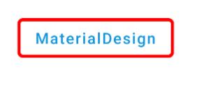
文字描边
<com.google.android.material.button.MaterialButton
    style="@style/Widget.MaterialComponents.Button.OutlinedButton"
    android:layout_width="wrap_content"
    android:layout_height="wrap_content"
    android:layout_marginTop="20dp"
    android:text="@string/app_name"
    android:textAllCaps="false"
    app:cornerRadius="5dp"
    app:rippleColor="@color/red"
    app:strokeColor="@color/red"
    app:strokeWidth="3dp" />
- 与上面不同的是,这里用了
style,区别在于上面的是常规Button状态下的描边,这个是文字Button状态下的描边。 app:rippleColor点击波纹颜色
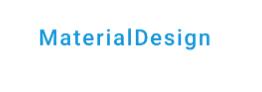
文字按钮
<com.google.android.material.button.MaterialButton
    style="@style/Widget.MaterialComponents.Button.TextButton"
    android:layout_width="wrap_content"
    android:layout_height="wrap_content"
    android:layout_marginTop="20dp"
    android:text="@string/app_name"
    android:textAllCaps="false" />
与常规使用方法一样,但是加了style,这个style在未选中的情况下,对背景色设置了透明。
圆形Button
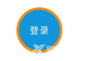
<com.google.android.material.button.MaterialButton
    android:layout_width="100dp"
    android:layout_height="100dp"
    android:layout_marginTop="20dp"
    android:insetTop="0dp"
    android:insetBottom="0dp"
    android:text="@string/login"
    android:textAllCaps="false"
    android:textSize="20sp"
    app:cornerRadius="999dp"
    app:strokeColor="@color/orange"
    app:strokeWidth="5dp" />
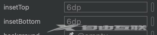
这里为什么来个圆形Button呢,是因为涉及到两个属性
android:insetTop上边距android:insetBottom下边距
这两个参数默认是6dp,不设置为0dp的话,就不是一个规则的圆。
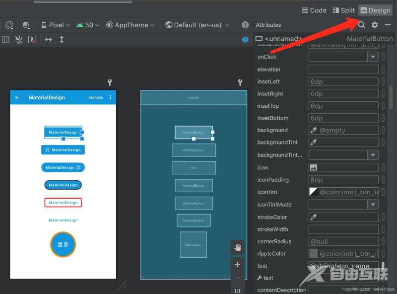
关于其他属性的默认参数,可以在xml文件的右上角,选中Design面板,选择要查看的View即可。
源码分析icon
唯一不足的是MaterialButton不能像chip一样给icon设置事件。
来看看源码中 icon具体是什么实现的:
  public void setIcon(@Nullable Drawable icon) {
    if (this.icon != icon) {
      this.icon = icon;
      updateIcon(/* needsIconUpdate = */ true);
    }
  }
这里比较简单,继续看调用的updateIcon方法
  private void updateIcon(boolean needsIconUpdate) {
    // Forced icon update
    if (needsIconUpdate) {
      resetIconDrawable(isIconStart);
      return;
    }
	...
    if (hasIconChanged) {
      resetIconDrawable(isIconStart);
    }
  }
有省略,看关键两段代码都调用了resetIconDrawable方法,继续
  private void resetIconDrawable(boolean isIconStart) {
    if (isIconStart) {
      TextViewCompat.setCompoundDrawablesRelative(this, icon, null, null, null);
    } else {
      TextViewCompat.setCompoundDrawablesRelative(this, null, null, icon, null);
    }
  }
相信到这里很多人就明白了,icon的实现等同于drawableStart。
只不过在MaterialButton中drawableStart是没有效果的,而是icon和iconGravity配合使用来达到效果。
属性
关于xml属性,我做了一个整理
Github
https://github.com/yechaoa/MaterialDesign
感谢
官方文档
最后
到此这篇关于Android MaterialButton使用实例详解的文章就介绍到这了,更多相关Android MaterialButton使用内容请搜索自由互联以前的文章或继续浏览下面的相关文章希望大家以后多多支持自由互联!