Android自定义控件: 找不到自己想要的控件?不如自己动手做一个! (注:文章使用SM.MS图床,国庆期间可能访问较慢) 沿用上一次的知识,背景不止可以用在按钮中,也可以应用在布局
Android自定义控件:
找不到自己想要的控件?不如自己动手做一个!
(注:文章使用SM.MS图床,国庆期间可能访问较慢)
沿用上一次的知识,背景不止可以用在按钮中,也可以应用在布局中,但是这一次只修改背景。
为布局编写不同状态背景bg_login.xml:
<?xml version="1.0" encoding="utf-8"?>
<selector xmlns:android="http://schemas.android.com/apk/res/android">

    <item android:state_pressed="false" android:drawable="@drawable/bg_login_default"/>

    <item android:state_pressed="true" android:drawable="@drawable/bg_login_pressed"/>

</selector>
其中bg_login_default.xml:
<?xml version="1.0" encoding="utf-8"?>
<shape xmlns:android="http://schemas.android.com/apk/res/android"
    android:shape="rectangle">

    <solid android:color="#FFFFFF"/>

</shape>
另一个类似,不介绍。
接下来编写我们想要的布局
item_layout.xml:
<?xml version="1.0" encoding="utf-8"?>
<android.support.constraint.ConstraintLayout
    xmlns:android="http://schemas.android.com/apk/res/android"
    xmlns:app="http://schemas.android.com/apk/res-auto"
    android:layout_width="match_parent"
    android:layout_height="wrap_content">

    <LinearLayout
        android:id="@+id/linearLayout"
        android:clickable="true"
        android:focusable="true"
        android:orientation="vertical"
        android:background="@drawable/bg_login"
        android:layout_width="match_parent"
        android:layout_height="wrap_content"
        app:layout_constraintEnd_toEndOf="parent"
        app:layout_constraintStart_toStartOf="parent"
        app:layout_constraintTop_toTopOf="parent">

        <android.support.constraint.ConstraintLayout
            android:layout_width="match_parent"
            android:layout_height="40dp">

            <TextView
                android:id="@+id/tv_left"
                android:layout_width="wrap_content"
                android:layout_height="wrap_content"
                android:layout_marginStart="20dp"
                android:layout_marginLeft="20dp"
                android:gravity="center"
                android:text="标题"
                android:textColor="#454444"
                android:textSize="15sp"
                app:layout_constraintBottom_toBottomOf="parent"
                app:layout_constraintStart_toStartOf="parent"
                app:layout_constraintTop_toTopOf="parent" />

            <TextView
                android:id="@+id/tv_right"
                android:layout_width="wrap_content"
                android:layout_height="wrap_content"
                android:layout_marginEnd="10dp"
                android:layout_marginRight="10dp"
                android:gravity="center"
                android:text="内容"
                android:textColor="#646464"
                android:textSize="14sp"
                app:layout_constraintBottom_toBottomOf="parent"
                app:layout_constraintEnd_toStartOf="@+id/arrow"
                app:layout_constraintTop_toTopOf="parent" />

            <ImageView
                android:id="@+id/arrow"
                android:layout_width="22dp"
                android:layout_height="22dp"
                android:layout_marginEnd="8dp"
                android:layout_marginRight="8dp"
                android:scaleType="center"
                android:src="@mipmap/arrow"
                app:layout_constraintBottom_toBottomOf="parent"
                app:layout_constraintEnd_toEndOf="parent"
                app:layout_constraintTop_toTopOf="parent" />

        </android.support.constraint.ConstraintLayout>

        <View
            android:layout_width="match_parent"
            android:layout_height="1px"
            android:background="#898888"/>
    </LinearLayout>

</android.support.constraint.ConstraintLayout>
加了两个Text和一个Image,还有一个灰色的背景条用于分割两个组件。注:图片的背景是在阿里的图标库里找的
效果:
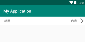
还行,凑合着看......
然后编写自定义控件的类ItemView:
package com.fitsoft;

import android.content.Context;
import android.support.constraint.ConstraintLayout;
import android.util.AttributeSet;
import android.view.LayoutInflater;
import android.view.View;
import android.widget.ImageView;
import android.widget.TextView;

public class ItemView extends ConstraintLayout {

    TextView tv_left;
    TextView tv_right;
    ImageView tv_arrow;

    public ItemView(Context context, AttributeSet attrs) {
        super(context, attrs);

        LayoutInflater.from(context).inflate(R.layout.item_layout, this);

        tv_left = findViewById(R.id.tv_left);
        tv_right = findViewById(R.id.tv_right);
        tv_arrow = findViewById(R.id.arrow);

    }

    /**
     * 设置内容
     * @param tvLeftStr 标题文字
     * @param tvRightStr 内容文字
     * @param isShowImage 是否显示图片
     */
    public void setView(String tvLeftStr, String tvRightStr, Boolean isShowImage){

        if(tvLeftStr != null){
            tv_left.setText(tvLeftStr);
        }

        if(tvRightStr != null){
            tv_right.setText(tvRightStr);
        }

        if(isShowImage){
            tv_arrow.setVisibility(View.VISIBLE);
        }else {
            tv_arrow.setVisibility(View.GONE);
        }

    }
}
很简单的一些方法,首先绑定布局,然后将组件的设置内容的方法写在了一个方法中。
然后在我们需要加载自定义控件的地方加上,我加在了主布局activity_main.xml中:
<?xml version="1.0" encoding="utf-8"?>
<android.support.constraint.ConstraintLayout
    xmlns:android="http://schemas.android.com/apk/res/android"
    xmlns:app="http://schemas.android.com/apk/res-auto"
    xmlns:tools="http://schemas.android.com/tools"
    android:background="#50E7B2"
    android:layout_width="match_parent"
    android:layout_height="match_parent"
    tools:context="com.fitsoft.MainActivity">

    <LinearLayout
        android:layout_width="match_parent"
        android:layout_height="wrap_content"
        android:orientation="vertical"
        app:layout_constraintEnd_toEndOf="parent"
        app:layout_constraintStart_toStartOf="parent"
        app:layout_constraintTop_toTopOf="parent">

        <com.fitsoft.ItemView
            android:id="@+id/item1"
            android:layout_width="match_parent"
            android:layout_height="wrap_content"
            android:layout_marginBottom="10dp"/>

        <com.fitsoft.ItemView
            android:id="@+id/item2"
            android:layout_width="match_parent"
            android:layout_height="wrap_content"
            android:layout_marginBottom="10dp"/>

        <com.fitsoft.ItemView
            android:id="@+id/item3"
            android:layout_width="match_parent"
            android:layout_height="wrap_content"
            android:layout_marginBottom="10dp"/>

        <com.fitsoft.ItemView
            android:id="@+id/item4"
            android:layout_width="match_parent"
            android:layout_height="wrap_content"
            android:layout_marginBottom="10dp"/>

    </LinearLayout>
</android.support.constraint.ConstraintLayout>
加了四个刚刚写完的自定义控件
在类中设置相应属性:
package com.fitsoft;
import android.os.Bundle;
import android.support.v7.app.AppCompatActivity;
public class MainActivity extends AppCompatActivity {
@Override
protected void onCreate(Bundle savedInstanceState) {
super.onCreate(savedInstanceState);
setContentView(R.layout.activity_main);
ItemView itemView1 = findViewById(R.id.item1);
ItemView itemView2 = findViewById(R.id.item2);
ItemView itemView3 = findViewById(R.id.item3);
ItemView itemView4 = findViewById(R.id.item4);
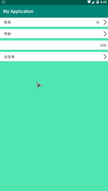
itemView1.setView("姓名", "张", true);
itemView2.setView("年龄", "", true);
itemView3.setView("", "沈阳", false);
itemView4.setView("出生地", "", true);
}
}
为了效果吗明显,我把背景改了,另外还要注意,布局如果使用不同状态,需要设置clickable属性为true,同时AndroidStudio会提示你设置focusable属性,将其设置为true就OK
效果图: