目录
- 1.前言
- 2.效果
- 3.简介
- 4.实现拆解
- 4.1TabLayout
- 4.2.TextView
- 4.3.Button
- 4.4.ImageView
- 4.5.BottomNavigationView
- 5.常用API整理
- 6.源码解析
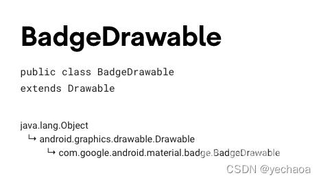
- 6.1.BadgeDrawable.create
- 6.2.BadgeUtils.attachBadgeDrawable
- 7.Github
- 8.相关文档
- 附:Android开发版本和API等级对应关系
- 总结
1.前言
通常情况下,我们在做小红点效果的时候,会有两种选择:
自定义BadgeView,然后设置给目标Viewxml写一个View,然后设置shape
有的同学可能会想,能实现不就行了吗,是的,代码优不优雅的不重要,代码和人只要有一个能跑就行…
不过,今天来介绍一种不同的方式来实现小红点效果,或许会让你眼前一亮~
2.效果

3.简介
- 用途:给View添加动态显示信息(小红点提示效果)
- app主题需使用
Theme.MaterialComponents.* - api 要求
18+也就Android 4.3以上(api等级对应关系见文末)
4.实现拆解
4.1TabLayout

xml:
    <com.google.android.material.tabs.TabLayout
        android:id="@+id/tab_layout"
        android:layout_width="0dp"
        android:layout_height="wrap_content"
        android:layout_margin="10dp"
        android:background="#FFFAF0"
        android:textAllCaps="false"
        app:layout_constraintLeft_toLeftOf="parent"
        app:layout_constraintRight_toRightOf="parent"
        app:layout_constraintTop_toBottomOf="@+id/include"
        app:tabIndicator="@drawable/shape_tab_indicator"
        app:tabIndicatorColor="@color/colorPrimary"
        app:tabIndicatorFullWidth="false"
        app:tabMaxWidth="200dp"
        app:tabMinWidth="100dp"
        app:tabMode="fixed"
        app:tabSelectedTextColor="@color/colorPrimary"
        app:tabTextColor="@color/gray">

        <com.google.android.material.tabs.TabItem
            android:layout_width="wrap_content"
            android:layout_height="wrap_content"
            android:text="Android" />

        <com.google.android.material.tabs.TabItem
            android:layout_width="wrap_content"
            android:layout_height="wrap_content"
            android:text="Kotlin" />

        <com.google.android.material.tabs.TabItem
            android:layout_width="wrap_content"
            android:layout_height="wrap_content"
            android:text="Flutter" />

    </com.google.android.material.tabs.TabLayout>
kotlin:
    private fun initTabLayout() {
        // 带数字小红点
        mBinding.tabLayout.getTabAt(0)?.let {
            it.orCreateBadge.apply {
                backgroundColor = ContextCompat.getColor(this@BadgeDrawableActivity, R.color.red)
                badgeTextColor = ContextCompat.getColor(this@BadgeDrawableActivity, R.color.white)
                number = 6
            }
        }

        // 不带数字小红点
        mBinding.tabLayout.getTabAt(1)?.let {
            it.orCreateBadge.apply {
                backgroundColor = ContextCompat.getColor(this@BadgeDrawableActivity, R.color.red)
                badgeTextColor = ContextCompat.getColor(this@BadgeDrawableActivity, R.color.white)
            }
        }
    }
4.2.TextView

xml:
    <TextView
        android:id="@+id/tv_badge"
        android:layout_width="wrap_content"
        android:layout_height="wrap_content"
        android:layout_marginTop="30dp"
        android:text="小红点示例"
        android:textAllCaps="false"
        app:layout_constraintLeft_toLeftOf="parent"
        app:layout_constraintRight_toRightOf="parent"
        app:layout_constraintTop_toBottomOf="@+id/tab_layout" />
kotlin:
    private fun initTextView() {
        // 在视图树变化
        mBinding.tvBadge.viewTreeObserver.addOnGlobalLayoutListener(object : ViewTreeObserver.OnGlobalLayoutListener {
            override fun onGlobalLayout() {
                BadgeDrawable.create(this@BadgeDrawableActivity).apply {
                    badgeGravity = BadgeDrawable.TOP_END
                    number = 6
                    backgroundColor = ContextCompat.getColor(this@BadgeDrawableActivity, R.color.colorPrimary)
                    isVisible = true
                    BadgeUtils.attachBadgeDrawable(this, mBinding.tvBadge)
                }
                mBinding.tvBadge.viewTreeObserver.removeOnGlobalLayoutListener(this)
            }
        })
    }
4.3.Button
xml:
    <FrameLayout
        android:id="@+id/fl_btn"
        android:layout_width="wrap_content"
        android:layout_height="wrap_content"
        android:layout_marginTop="30dp"
        android:padding="10dp"
        app:layout_constraintLeft_toLeftOf="parent"
        app:layout_constraintRight_toRightOf="parent"
        app:layout_constraintTop_toBottomOf="@+id/tv_badge">

        <com.google.android.material.button.MaterialButton
            android:id="@+id/mb_badge"
            android:layout_width="wrap_content"
            android:layout_height="wrap_content"
            android:text="Button小红点示例" />

    </FrameLayout>
kotlin:
    private fun initButton() {
        mBinding.mbBadge.viewTreeObserver.addOnGlobalLayoutListener(object : ViewTreeObserver.OnGlobalLayoutListener {
            @SuppressLint("UnsafeOptInUsageError")
            override fun onGlobalLayout() {
                BadgeDrawable.create(this@BadgeDrawableActivity).apply {
                    badgeGravity = BadgeDrawable.TOP_START
                    number = 6
                    backgroundColor = ContextCompat.getColor(this@BadgeDrawableActivity, R.color.red)
                    // MaterialButton本身有间距,不设置为0dp的话,可以设置badge的偏移量
                    verticalOffset = 15
                    horizontalOffset = 10
                    BadgeUtils.attachBadgeDrawable(this, mBinding.mbBadge, mBinding.flBtn)
                }
                mBinding.mbBadge.viewTreeObserver.removeOnGlobalLayoutListener(this)
            }
        })
    }
关于MaterialButton的使用及解析可查看:Android MaterialButton使用详解,告别shape、selector
4.4.ImageView
xml:
    <FrameLayout
        android:id="@+id/fl_img"
        android:layout_width="match_parent"
        android:layout_height="wrap_content"
        android:layout_marginTop="30dp"
        android:padding="10dp"
        app:layout_constraintLeft_toLeftOf="parent"
        app:layout_constraintRight_toRightOf="parent"
        app:layout_constraintTop_toBottomOf="@+id/fl_btn">

        <com.google.android.material.imageview.ShapeableImageView
            android:id="@+id/siv_badge"
            android:layout_width="wrap_content"
            android:layout_height="wrap_content"
            android:layout_gravity="center"
            android:contentDescription="Image小红点示例"
            android:src="@mipmap/ic_avatar" />

    </FrameLayout>
kotlin:
    private fun initImageView() {
        mBinding.sivBadge.viewTreeObserver.addOnGlobalLayoutListener(object : ViewTreeObserver.OnGlobalLayoutListener {
            @SuppressLint("UnsafeOptInUsageError")
            override fun onGlobalLayout() {
                BadgeDrawable.create(this@BadgeDrawableActivity).apply {
                    badgeGravity = BadgeDrawable.TOP_END
                    number = 99999
                    // badge最多显示字符,默认999+ 是4个字符(带'+'号)
                    maxCharacterCount = 3
                    backgroundColor = ContextCompat.getColor(this@BadgeDrawableActivity, R.color.red)
                    BadgeUtils.attachBadgeDrawable(this, mBinding.sivBadge, mBinding.flImg)
                }
                mBinding.sivBadge.viewTreeObserver.removeOnGlobalLayoutListener(this)
            }
        })
    }
关于ShapeableImageView的使用及解析可查看:Android ShapeableImageView使用详解,告别shape、三方库
4.5.BottomNavigationView
xml:
    <com.google.android.material.bottomnavigation.BottomNavigationView
        android:id="@+id/navigation_view"
        android:layout_width="0dp"
        android:layout_height="wrap_content"
        android:layout_margin="10dp"
        android:layout_marginStart="0dp"
        android:layout_marginEnd="0dp"
        android:background="?android:attr/windowBackground"
        app:itemBackground="@color/colorPrimary"
        app:itemIconTint="@color/white"
        app:itemTextColor="@color/white"
        app:layout_constraintBottom_toBottomOf="parent"
        app:layout_constraintLeft_toLeftOf="parent"
        app:layout_constraintRight_toRightOf="parent"
        app:menu="@menu/navigation" />
kotlin:
    private fun initNavigationView() {
        mBinding.navigationView.getOrCreateBadge(R.id.navigation_home).apply {
            backgroundColor = ContextCompat.getColor(this@BadgeDrawableActivity, R.color.red)
            badgeTextColor = ContextCompat.getColor(this@BadgeDrawableActivity, R.color.white)
            number = 9999
        }
    }
TabLayout和BottomNavigationView源码中直接提供了创建
BadgeDrawable的api,未提供的使用BadgeUtils。
5.常用API整理
6.源码解析
来一段最简单的代码示例看看:
BadgeDrawable.create(this@BadgeDrawableActivity).apply {
    // ...
    BadgeUtils.attachBadgeDrawable(this, mBinding.mbBadge, mBinding.flBtn)
}
不难发现,有两个关键点:
- BadgeDrawable.create
- BadgeUtils.attachBadgeDrawable
下面继续跟一下,看看源码里究竟是做了什么
6.1.BadgeDrawable.create
create实际调用的是构造方法:
  private BadgeDrawable(@NonNull Context context) {
    this.contextRef = new WeakReference<>(context);
    ThemeEnforcement.checkMaterialTheme(context);
    Resources res = context.getResources();
    badgeBounds = new Rect();
    shapeDrawable = new MaterialShapeDrawable();

    badgeRadius = res.getDimensionPixelSize(R.dimen.mtrl_badge_radius);
    badgeWidePadding = res.getDimensionPixelSize(R.dimen.mtrl_badge_long_text_horizontal_padding);
    badgeWithTextRadius = res.getDimensionPixelSize(R.dimen.mtrl_badge_with_text_radius);

    textDrawableHelper = new TextDrawableHelper(/* delegate= */ this);
    textDrawableHelper.getTextPaint().setTextAlign(Paint.Align.CENTER);
    this.savedState = new SavedState(context);
    setTextAppearanceResource(R.style.TextAppearance_MaterialComponents_Badge);
  }
构造方法里有这么一行:ThemeEnforcement.checkMaterialTheme(context); 检测Material主题,如果不是会直接抛出异常
  private static void checkTheme(
      @NonNull Context context, @NonNull int[] themeAttributes, String themeName) {
    if (!isTheme(context, themeAttributes)) {
      throw new IllegalArgumentException(
          "The style on this component requires your app theme to be "
              + themeName
              + " (or a descendant).");
    }
  }
这也是上面为什么说主题要使用Theme.MaterialComponents.*
然后创建了一个文本绘制帮助类,TextDrawableHelper
比如设置文本居中:textDrawableHelper.getTextPaint().setTextAlign(Paint.Align.CENTER);
其他的就是text属性的获取和设置,跟我们平时设置一毛一样,比较好理解。
绘制文本之后怎么显示出来呢?继续跟attachBadgeDrawable。
6.2.BadgeUtils.attachBadgeDrawable
    public static void attachBadgeDrawable(@NonNull BadgeDrawable badgeDrawable, @NonNull View anchor, @Nullable FrameLayout customBadgeParent) {
        setBadgeDrawableBounds(badgeDrawable, anchor, customBadgeParent);
        if (badgeDrawable.getCustomBadgeParent() != null) {
            badgeDrawable.getCustomBadgeParent().setForeground(badgeDrawable);
        } else {
            if (USE_COMPAT_PARENT) {
                throw new IllegalArgumentException("Trying to reference null customBadgeParent");
            }
            anchor.getOverlay().add(badgeDrawable);
        }
    }
这里先是判断badgeDrawable.getCustomBadgeParent() != null,这个parent view的类型就是FrameLayout,不为空的情况下,层级前置。
为空的情况下先是判断了if (USE_COMPAT_PARENT),这里其实是对api level的判断
    static {
        USE_COMPAT_PARENT = VERSION.SDK_INT < 18;
    }
核心代码:
anchor.getOverlay().add(badgeDrawable);
如果有同学做过类似全局添加View的需求,这行代码就看着比较熟悉了。
ViewOverlay,视图叠加,也可以理解为浮层,在不影响子view的情况下,可以添加、删除View,这个api就是android 4.3加的,这也是为什么前面说api 要求18+。
ok,至此关于BadgeDrawable的使用和源码解析就介绍完了。
7.Github
https://github.com/yechaoa/MaterialDesign
8.相关文档
- BadgeDrawable
- BadgeUtils
- ViewOverlay
附:Android开发版本和API等级对应关系
总结
到此这篇关于Android涨姿势知识点之BadgeDrawable的文章就介绍到这了,更多相关Android BadgeDrawable详解内容请搜索自由互联以前的文章或继续浏览下面的相关文章希望大家以后多多支持自由互联!