本文实例为大家分享了vue实现tab栏切换效果的具体代码,供大家参考,具体内容如下 一个简单的tab栏切换组件,由tabs以及tab-pane组成 效果图 使用 template div class="container" tabs
本文实例为大家分享了vue实现tab栏切换效果的具体代码,供大家参考,具体内容如下
一个简单的tab栏切换组件,由tabs以及tab-pane组成
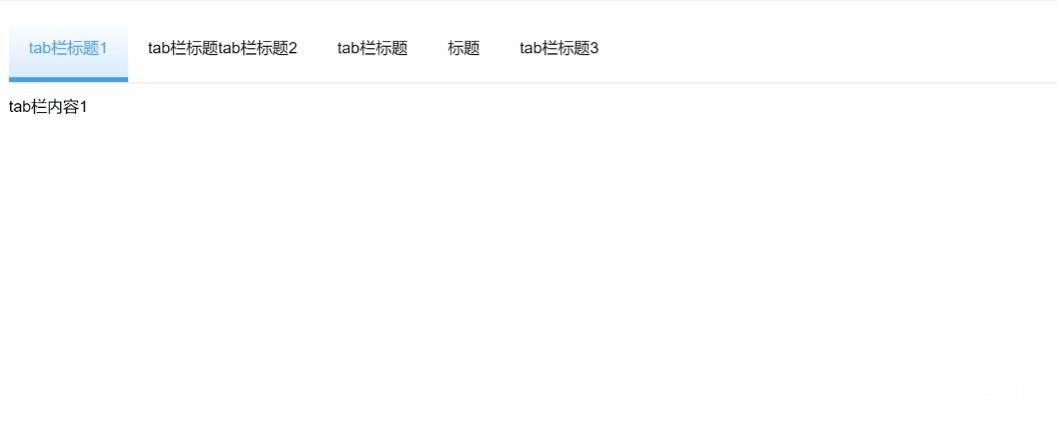
效果图
使用
<template>
  <div class="container">
    <tabs
      default-active="2"
      class="build-tabs"
    >
      <tab-pane
        label="tab栏标题1"
        index="1"
      >tab栏内容1</tab-pane>
      <tab-pane
        label="tab栏标题tab栏标题2"
        index="2"
      >
        tab栏内容2
      </tab-pane>
      <tab-pane
        label="tab栏标题"
        index="3"
      >tab栏内容3</tab-pane>
      <tab-pane
        label="标题"
        index="4"
      >tab栏内容4</tab-pane>
      <tab-pane
        label="tab栏标题3"
        index="5"
      >tab栏内容5</tab-pane>
    </tabs>
  </div>
</template>
tabs
<template>
  <div
    v-show="pans.length"
    class="tabs"
  >
    <div class="tab-title">
      <div
        v-for="(item) in pans"
        :key="item.id"
        class="item"
        :class="{ 'active': currentActive === item.index }"
        @click="changeTab(item.index)"
      >{{ item.label }}</div>
    </div>
    <div class="tab-content">
      <slot></slot>
    </div>
  </div>
</template>

<script>
export default {
  props: {
    mode: {
      type: String,
      default: "horizontal/vertical"
    },
    defaultActive: {
      type: String | Number,
      default: '1'
    },
    defaultColor: {
      type: String,
      default: '#409EFF'
    }
  },
  data: () => {
    return {
      currentActive: '',
      pans: []
    }
  },
  computed: {

  },
  watch: {
    defaultActive: {
      handler (newVal) {
        this.currentActive = newVal
      },
      immediate: true
    }
  },
  mounted () {
  },

  methods: {
    changeTab (val) {
      this.currentActive = val
    },
  }
}
</script>
<style scoped lang="scss">
::root {
  --color: "#409EFF";
}
.tabs {
  .tab-title {
    display: flex;
    // align-items: flex-start;
    align-items: stretch;    // 侧边栏时,使侧栏高度与内容高度一致,按最高的显示
    margin-bottom: 14px;
    border-bottom: 1px solid #ccc;
    .item {
      padding: 20px;
      /* padding-bottom: 20px; */
      cursor: pointer;
      white-space: nowrap;
    }
    .active {
      // color: var(--color);
      color: #409EFF;
      /* padding-bottom: 15px; // 修正边框值:20px - 5px = 15px */
      border-bottom: 5px solid #409EFF;
      background-image: linear-gradient(
        to top,
        rgba($color: #409EFF, $alpha: 0.2),
        transparent
      );
    }
  }
}
</style>
tab-pane
<template>
  <div
    v-show="show && renderPan"
    class="tab-pane"
  >
    <slot></slot>
  </div>
</template>
<script>
export default {
  name: 'tabPane',
  props: {
    index: {
      type: [String, Number],
      default: ''
    },
    label: {
      type: String,
      required: true
    }
  },
  data: () => {
    return {
      renderPan: false
    }
  },
  computed: {
    show () {
      if (this.$parent.currentActive === this.index) return true
      return false
    }
  },
  mounted () {
    this.$parent.pans.push({ id: Date.parse(new Date()) + Math.random(), index: this.index, label: this.label });
    this.renderPan = true
  },
  methods: {
  },
}
</script>
<style scoped lang="scss">
</style>
以上就是本文的全部内容,希望对大家的学习有所帮助,也希望大家多多支持易盾网络。