伪元素和伪类
说到这个,我们先回顾一下,伪类选择器和伪元素选择器,老版的浏览器没有严格区分下面 2 种写法。
a:after{}
a::after{}
在新的标准中,单冒号(:)用于 CSS3 伪类,双冒号(::)用于 CSS3 伪元素,我们平时开发时可以注意一下,当然大多数浏览器两种写法都能识别。
常见伪元素和伪类
伪类
:link, :visited, :hover, :active, :focus, :first-child, :last-child, :nth-child, :nth-last-child, :not()
伪类一般用于一个元素的某个状态,比如说鼠标悬浮,按钮点击,链接已经访问,输入框聚焦等,还用于选择某个特殊元素,比如说多个元素中的第一个,最后一个,偶数,奇数等。其作用是对某个符合以上条件的元素添加一些样式。
a:hover{
        text-decoration: underline;
    }
a:active {
    color: blue;
}
a:link {
    color: red;
}
a:visited {
    color: green;
}
上面的例子展示了一个a标签在不同状态下的不同样式,在未点击链接之前,a标签呈现红色字体(link),在鼠标移到a标签上是,a标签出现下划线(hover),在鼠标按下的时候,a标签变为蓝色(active),点击完了之后,a标签变为绿色(visited)。可以看到,伪类的作用是为了给不同状态的标签添加样式。
伪元素
::first-letter, ::first-line, ::before, ::after
在内容模块中提到,伪元素如果没有设置“content”属性,伪元素是无用的。使用伪元素插入的内容在页面的源码里是不可见的,只能在 css 里可见。插入的元素在默认情况下是内联元素(或者,在 html5 中,在文本语义的类别里)。因此,为了给插入的元素赋予高度,填充,边距等等,你通常必须显式地定义它是一个块级元素。还要注意的是典型的 CSS 继承规则适用于插入的元素。例如,你有字体系列黑体,宋体,无衬线字体应用到 body 元素里,然后伪元素会像其他元素一样继承这些字体系列。伪元素不会自然继承自父元素(如 padding margins)的样式。你的直觉是 :before 和 :after 伪元素可能是插入的内容会被注入到目标元素的前或后注入。其实不是这样的,注入的内容将是有关联的目标元素的子元素,但它会被置于这个元素的任何内容的“前”或“后”。
<head>
    <style type="text/css">
        p.box::before {
          content: "#";
          border: solid 1px black;
          padding: 2px;
          margin: 0 10px 0 0;
        }
        p.box::after {
          content: "#";
          border: solid 1px black;
          padding: 2px;
          margin: 0 10px 0 0;
        }
    </style>
</head>
<body>
<p class="box">Other content.</p>
</body>
运行效果:
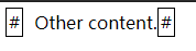
可以看到,我们html部分只写了一个元素,但是我们利用伪元素渲染出来 3 个部分,前中后,这里我们可以认为,伪元素一般用来辅助html的元素。但在内容页面的源码又看不到,利用伪元素可以实现很多神奇的功能,这里不做具体讲解,后面再出具体教程。
神奇的伪类:focus-within
言归正传,回到我们的主角focus-within,我们知道,伪类focus是指一个元素获得焦点时,为其添加样式。focus-within的范围更广,它表示一个元素获得焦点,或该元素的后代元素获得焦点。划重点,它或它的后代获得焦点。这也就意味着,它或它的后代获得焦点,都可以触发:focus-within。
这个属性有点类似Javascript的事件冒泡,从可获焦元素开始一直冒泡到根元素html,都可以接收触发:focus-within事件,类似下面这个简单的例子这样:
<html>
 <div class="box g-father">
        <div class="box g-children">
            <div class="box button" tabindex="1">button</div>
        </div>
  </div>
  <div class="g-body">HTML</div>
  <style>
    div {
      box-sizing: border-box;
    }
    .button,.g-children {
        width: 100%;
        height: 100%;
        padding: 20px;
        border: 1px solid;
    }
    .g-father {
        width: 200px;
        height: 200px;
        padding: 20px;
        border: 1px solid;
    }
    .g-body {
        margin-top: 20px;
        width: 200px;
        border: 1px solid;
    }
    .g-body:focus-within {
        background-color: #5daf34;
    }
    .g-father:focus-within {
        background-color: #3a8ee6;
    }
    .g-children:focus-within{
        background-color: #2c3e50;
    }
    .button:focus-within {
        background-color: #606266;
        color: red;
    }
        </style>
</html>
运行结果:
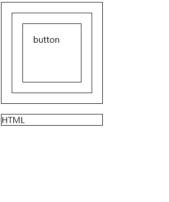
可以看到,在button获得焦点时,因为冒泡的原因,它的父级元素全部应用了:focus-within的样式。这里值得注意的是,正常的div是不能获得焦点的,设置 tabindex 属性才能获取焦点,同时按键盘 Tab 键也可让其获取焦点,其中 tabindex 的值越小在 tab 键切换的时候就会首先聚焦。根据:focus-within的特性,我们在不利用 js 的情况下,实现很多实用性的功能。
感应用户聚焦区域
利用focus-within可以增加用户的感知区域,让用户获得更好的视觉反馈。
<html>
 <div class="g-container">
      <input type="text" placeholder="user name" class="g_input" >
      <input type="text" placeholder="code" class="g_input" >
  </div>
  <style>
    .g-container {
        margin-top: 10vh;
    }
    .g-container {
        padding: 10px;
        width: 30vw;
        border: 1px solid #eee;
        transition: all .3s;
        text-align: center;
    }
    .g-container:focus-within {
        transform: translateY(-4px);
        box-shadow: 0 0 10px #ddd;
        border-color: hsl(199, 98%, 48%);
    }
    .g_input {
        border: none;
        width: 20vw;
        padding: 15px;
        font-size: 18px;
        box-sizing: border-box;
        border: 1px solid #ddd;
        overflow: hidden;
        transition: 0.3s;
        box-shadow: 0 0 0px #ddd;
        &:focus {
            box-shadow: 0 0 10px #ddd;
            border-color: hsl(199, 98%, 48%);
        }
    }
    </style>
</html>
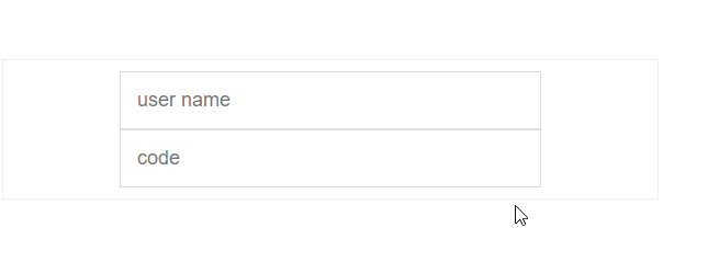
可以看到在没有任何javascript逻辑控制情况下,用focus-within就实现了上面的效果。
实现离屏导航
我们先看一下效果:

可以看到是一个很棒的导航效果,而且真个实现没有使用javascript控制,这无疑在性能和体验上都有不少提升。具体源码可以看下面的地址:地址
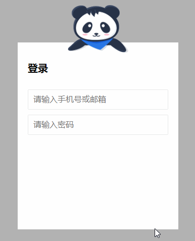
实现 B 站,掘金等网站登录动效切换
我们平时可能注意到了,B 站和掘金在用户输入密码的时候,上面的图片是捂着眼睛的,这里我们也可以用focus-within来实现。
<html>
 <div class="g-wrap"></div>
        <div class="g-container">
            <h2>登录</h2>
            <div class="g-username">
                <input maxlength="64" placeholder="请输入手机号或邮箱" class="input">
                <img src="https://b-gold-cdn.xitu.io/v3/static/img/greeting.1415c1c.png" class="g-username">
            </div>
            <div class="g-password">
                <input type="password" maxlength="64" placeholder="请输入密码" class="input">
                <img src="https://b-gold-cdn.xitu.io/v3/static/img/blindfold.58ce423.png" class="g-password">
            </div>
            <img src="https://b-gold-cdn.xitu.io/v3/static/img/normal.0447fe9.png" class="g-normal">
    </div>
<style>
.g-wrap {
  position: fixed;
  top: 0;
  left: 0;
  bottom: 0;
  right: 0;
  background: rgba(0, 0, 0, 0.3);
}

.g-container {
  position: relative;
  width: 318px;
  margin: 100px auto;
  height: 370px;
  padding: 20px;
  box-sizing: border-box;
  background: #fff;
  z-index: 10;
}
.g-container h2 {
  font-size: 20px;
  font-weight: bold;
  margin-bottom: 30px;
}
.g-container input {
  outline: none;
  padding: 10px;
  width: 100%;
  border: 1px solid #e9e9e9;
  border-radius: 2px;
  outline: none;
  box-sizing: border-box;
  font-size: 16px;
}

img {
  position: absolute;
  top: -20%;
  left: 50%;
  width: 120px;
  height: 95px;
  transform: translate(-50%, 0);
}

.g-username {
  margin-bottom: 10px;
}
.g-username img {
  display: none;
  width: 120px;
  height: 113px;
}

.g-username:focus-within ~ img {
  display: none;
}

.g-username:focus-within input {
  border-color: #007fff;
}
.g-username:focus-within img {
  display: block;
}

.g-password {
  margin-bottom: 10px;
}
.g-password img {
  display: none;
  width: 103px;
  height: 84px;
  top: -15%;
}

.g-password:focus-within ~ img {
  display: none;
}

.g-password:focus-within input {
  border-color: #007fff;
}
.g-password:focus-within img {
  display: block;
}
</style>
</html>
可以看到,在不适用js的情况下,也能实现动态切换图片的效果,但是还是有一些局限,dom排列只能是父级向上,不能把元素放在focus元素的子元素里面。所以没有js灵活,但是代码量更少。
focus-within 兼容性
因为 css3 的新增特性一直存在兼容问题,这里查询了一下它的兼容性,看到红色区域还是不算太惨淡,出来 ie,其他浏览器基本都支持了。

所有的源码都可以在我的仓库地址:地址
到此这篇关于css3的focus-within选择器的使用的文章就介绍到这了,更多相关css3的focus-within选择器内容请搜索自由互联以前的文章或继续浏览下面的相关文章,希望大家以后多多支持自由互联!